A More Usable Dashboard

Discipline:

Collaborators:
Moving an internal software product from V1 to V2 and discovering that the dashboard lack usability for 2 different user groups, customer sales and carrier sales.

User Stories
As a sales manager I like to be able to see my sales for the day, as well as my teams. Being able to view that as well as seeing other vital info like onboarding customers would be helpful in planning my day.
The Challenge
Tasked with updating all of the pages of our internal facing sales product from Version 1 to Version 2, I was faced with the challenge of updating our dashboard with more useful data that would be needed day-to-day for two different user groups.
Discovery
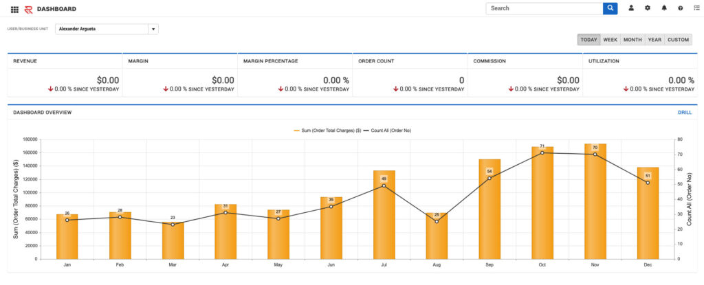
The discovery phase began with interviews of various stakeholders. This included ownership, director level sales positions and both customer and carrier sales. The current dashboard only updates once a day, so sales people were always going to be looking at old data. On top of that, the dashboard was more applicable to customer sales, and not carrier sales.
Through these interviews, I discovered gaps in the data that users needed. Key elements like their sales pipeline and their sales ramp for new employees were nowhere to be found.
The Approach
Taking the obvious route.
Through the discovery phase it was quite obvious some of the changes that needed to take place.
- The data on the dashboards needs to update more than once a day. The page is barely usable if users are viewing data that is a day old.
- The original dashboard was built for customer sales. Carrier sales also used this product, and the page is barely applicable.
- Better stats, not that the current ones were bad, but elements such as "Ramp Stats" would increase usability.It would also increase transparency and let users know how they were performing against their expectations.
How were we going to achieve this? The dashboard updating would have be through conversations with the data team. Our company was in our infancy of moving data to a data warehouse, but that was being done for reasons just like this. As far as the dashboard being applicable to to other departments, we'll split the dashboard into two separate pages based on the user's role: customer sales or carrier sales.
The Stats
Choosing the stats for the new dashboard came from interviews with directors, account managers and carrier sales managers, followed by creating prototypes, and then a series of testing. Of course, getting the right stats on the dashboard would come down to iterating and testing. Through the interviews I learned:
- More than anything account managers cared about where they were sales wise for the day, as well as how much commission they had made off those sales
- Ownership & management wanted and emphasis on onboarding customers, customer utilization (how much of their transportation spend we were capturing), as well as a push towards margin over revenue.
- The carrier side overlapped with the customer side on stats like margin, pipeline, and commission, but emphasized areas like on time pickup and deliveries and average match time.
The Layout
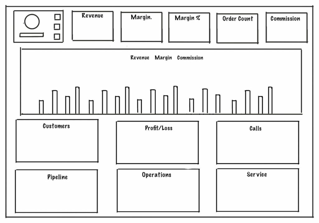
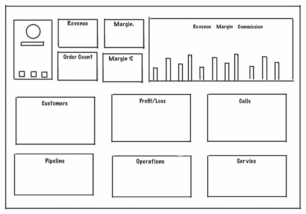
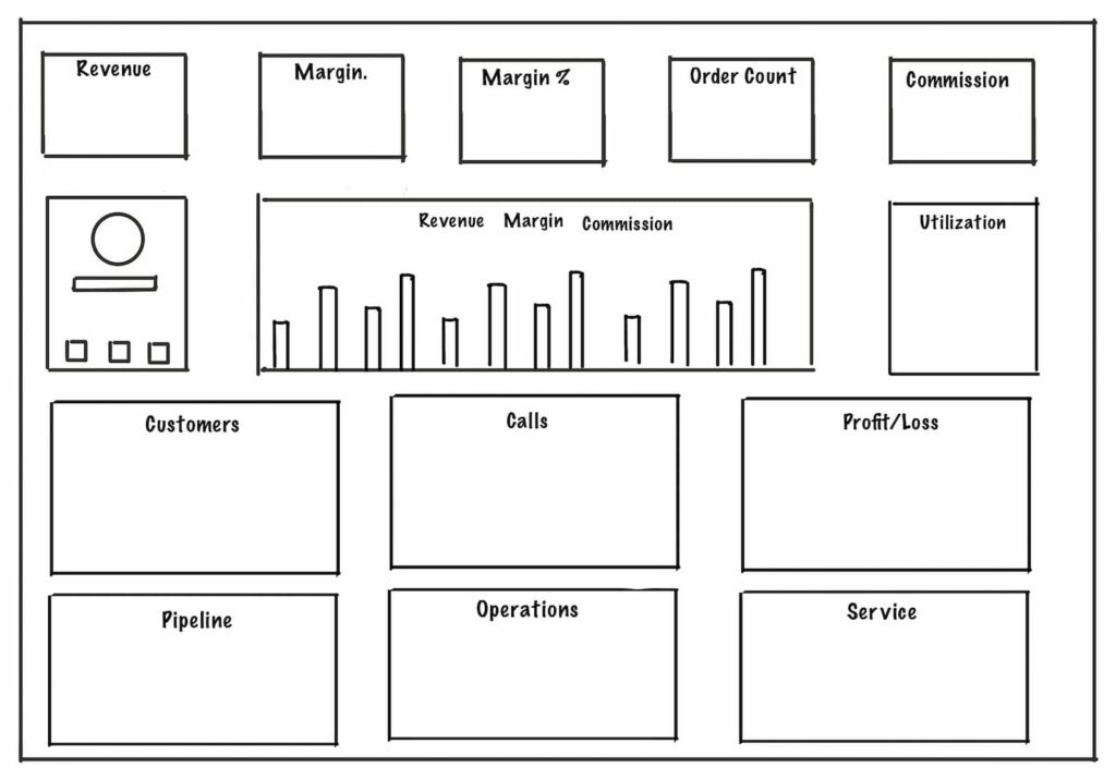
A lot of maneuvering and trial and error with trying to find the best way to display the data.
The Outcome
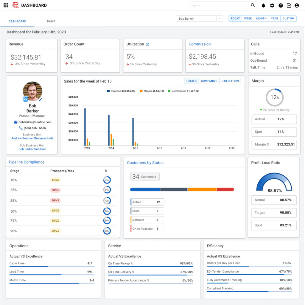
Ramp Page
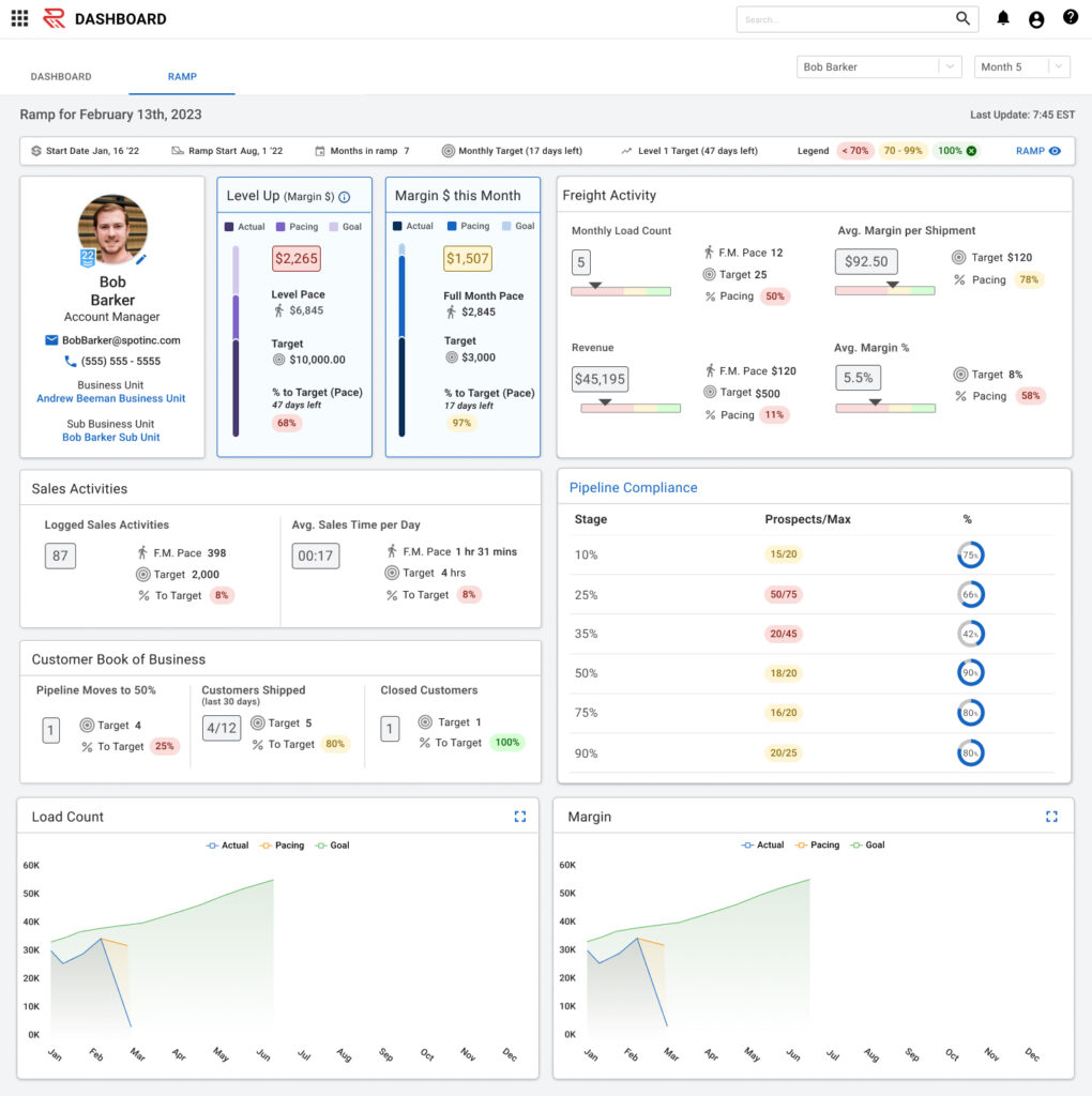
Ramp Table
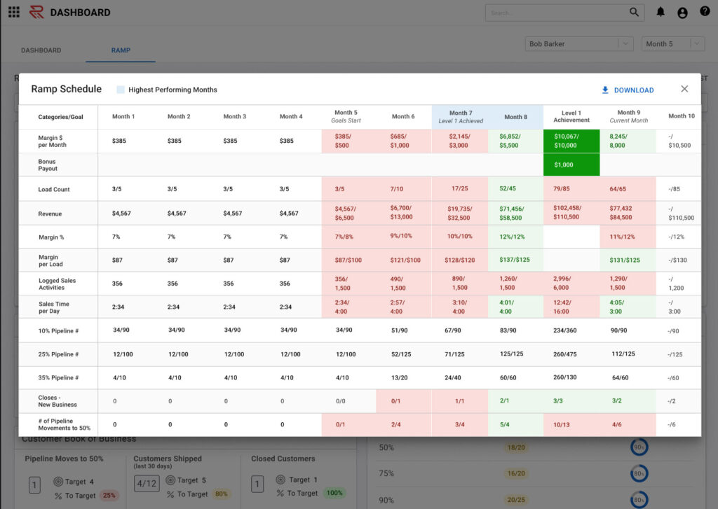
Customer Breakdown
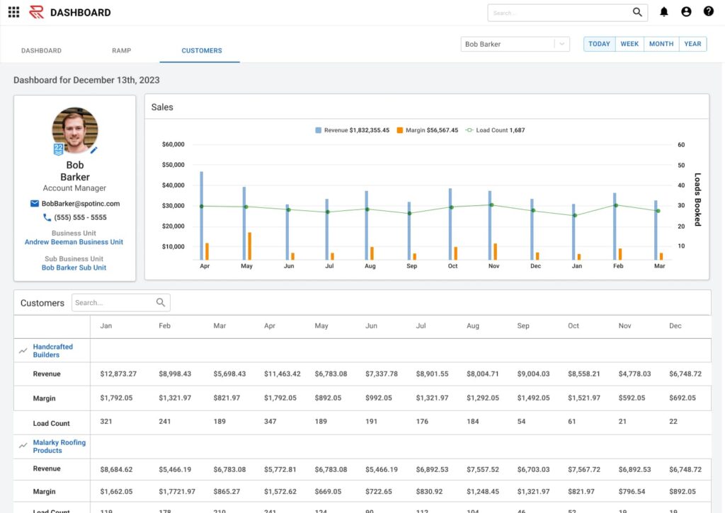
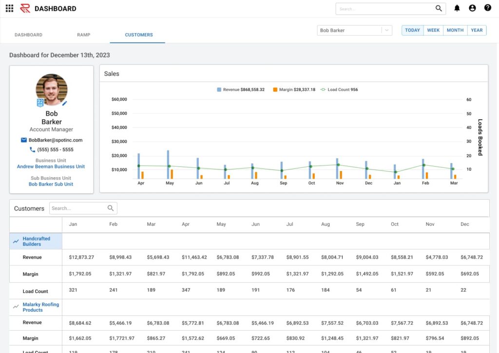
One last round of user testing brought tot he surface the need to be able to view customer lists. Users are able to click on the customer name and see a breakdown by month.
The Carrier Side
There is some overlap between the customer side and the carrier side as far as applicable data. Basic sales stats like margin, onboarding pipeline, and phone time are going to work on both sides. The carrier side cares more about on time pickups/deliveries, how long it's taking them to book loads, and repeat carriers.
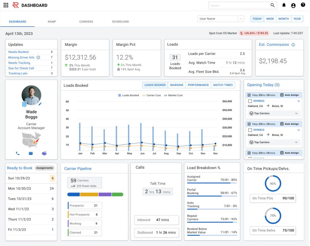
Carrier Ramp Page
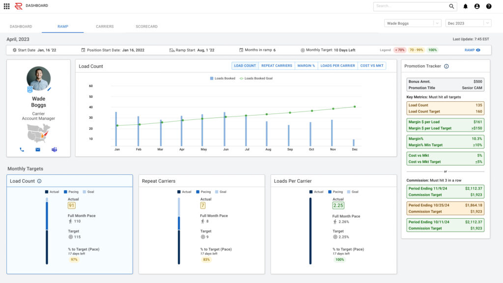
The carrier sales ramp page is tied to bonus payouts and promotions.
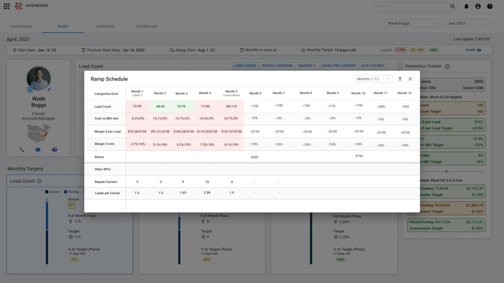
The ramp table is a monthly breakdown of key measurables.
Carrier Breakdown
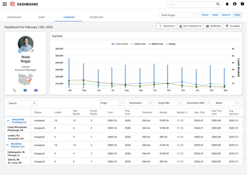
Similar to the account manager side, carrier sales has a tab that breaks down key measurements by carrier.
Carrier Sales Scorecard
The carrier scorecard is a breakdown of how carrier sales people measure against each other. This tab also allows users to see how their business unit stacks up against other, and measurements comparing lanes (origin & destination on shipments).
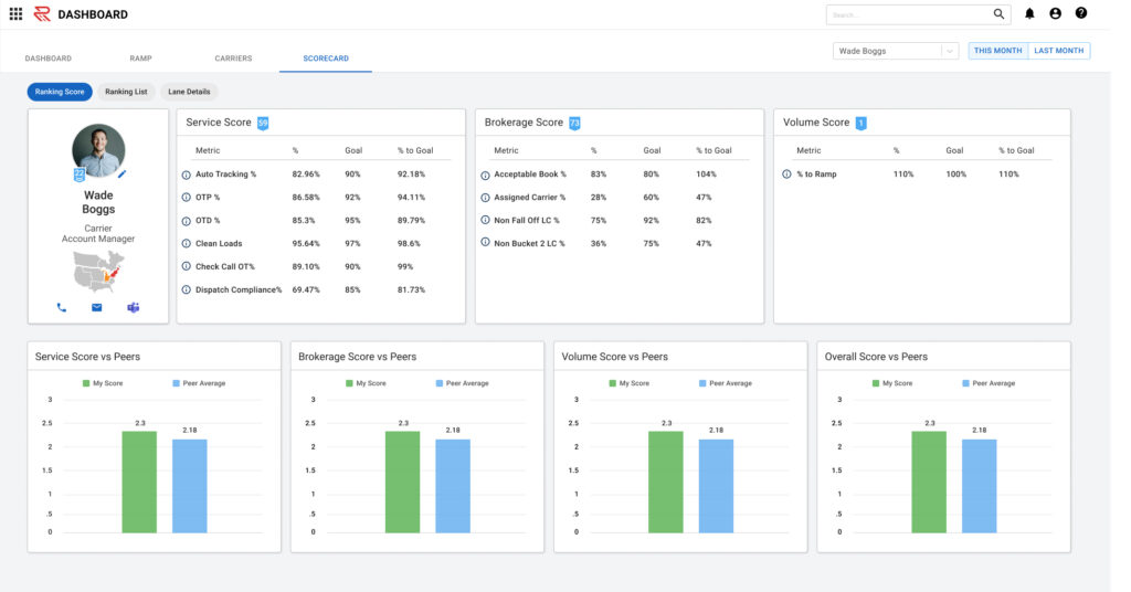
The first page of the carrier scorecard is a ranking of the user against their peers, based on sales metrics.
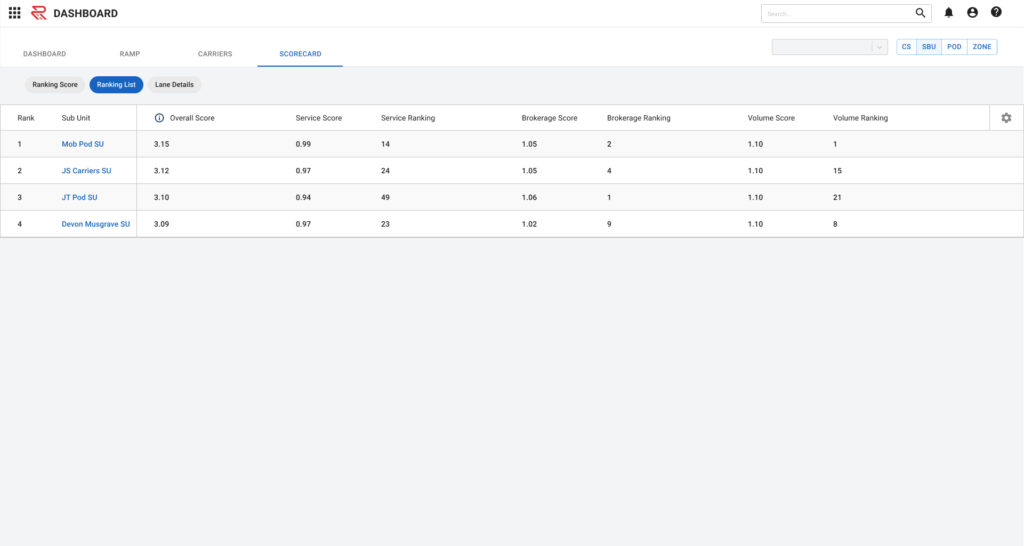
The ramp table is a monthly breakdown of key measurables.
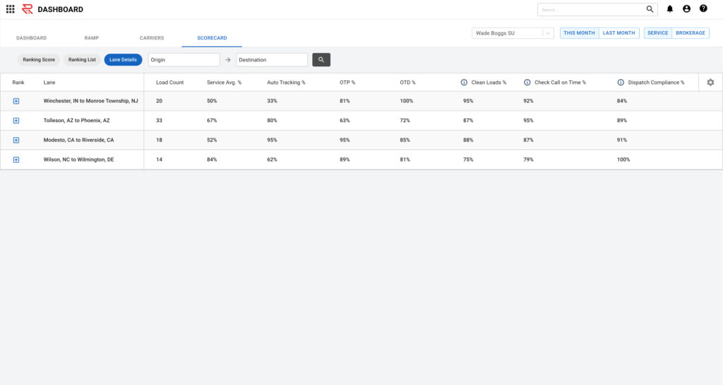
Lane details broken down by service scores.
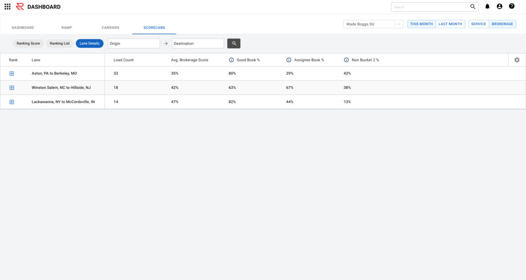
Lane details broken down by brokerage scores.
The Outcome
This project, which turned into two projects that took place over many months.
- - Favorable feedback from both customer and carrier sales
- - Better transparency for how both customer and carrier sales rank amongst peers
- - Increase in time savings for sales people and managers.
