
Sales Coaching

Discipline:

Collaborators:
Adding sales coaching to an already existing CRM. Owners of a logistics business wanted to add sales coaching to better set new sales people up for success, as well as track growth and increase sales. Ownership also wanted to see how sales management was doing managing employees. Many sales managers are using word docs to pass back and forth between themselves and account managers.
Sales coaching boosts team performance, with real-time coaching increasing annual revenue by 8%. A structured coaching program can lead to a 28% higher win rate and 88% increase in productivity. Sales coaching plays a pivotal role in professional development, boosting mid-level performance and job satisfaction.
My Role
My role was the sole designer on this project and to work with the company's sales leaders to bring their needs into a workable prototype. Initial conversations revealed that we were starting at ground-zero. Sales coaching was a tool they wanted and needed, but didn't have much experience with.
The Approach
My approach started with me meeting with one of the sales managers. We covered "The Why" we were doing this (to better set-up account managers for success), but he didn't bring much more to the table in regards to functionality. He did share a few screenshots of other coaching CRM's that he liked, but otherwise that was as much info as he had.
"I don't know what I want, but maybe I'll know when I see it"- Sales Leader
Research
Next, I began researching sales coaching CRM's. This included watching online demos, reading as much info as I could find, trying to learn how success was measured, and trying to see how we could create a model that would fit our business needs.
In follow-up meetings with sales leaders, it was decided that we should categorize the different aspects of sales. This way sales leaders could pick a specific sales category to focus on. The categories were: margin, sales pipeline, order count, activity, sales, active accounts, operations, and service.
Persona
As a sales person, I have a lot to learn when it comes to the business of logistics, but even more to learn when it comes to how and which potential customers to approach. Because of the steep learning curve, turnover rates for the account manager role are really high.

Cameron Burke
About
- Job: Account Manager
- Age: 22
- Education: College Grad
- Marital Status: Single
Goals
To gain financial success post college graduation while becoming established in an unfamiliar industry.
Frustrations
Understanding how the industry works, while trying to build relationships with prospective clients.
How Might We
To get a better sense of direction, the sales leader and I sat down and conducted a "How Might We" exercise. This helped us focus more on how we were going to accomplish our goals.


The results of the exercise and further discussion lead to the idea of breaking coaching up into three sections. One section where management can see an overview of their employees who report to them. The second page is where the individual coaching happens. The third page would be a history of past coaching assignments. From here managers would be able to gauge growth and success.
The Solution
The Overiew Page
A screen for managers to view the sales people they manage so they can take a quick snapshot of their progress.

Overview Continued
The overview page allows managers to expand on each employee for a quick view of their current assignments, a history of past coaching paths and the ability to quickly filter to find particular coaching assignments. Managers can also click on coaching assignments to go to that page.

Coaching
This is the page where coaching happens. It's main focus is to facilitate conversation between a sales person and their manager. These coaching sessions are based on sales activities, which could be something like a phone call that's already happened or approaching a potential new customer. Sales managers set a measurable goal, and account managers are rated by if they met the goal, if they didn't meet the goal, but showed growth, or if they didn't meet the goal and growth went backwards. Managers also rate AM's based on how engaged how coachable, and how prepared they are.

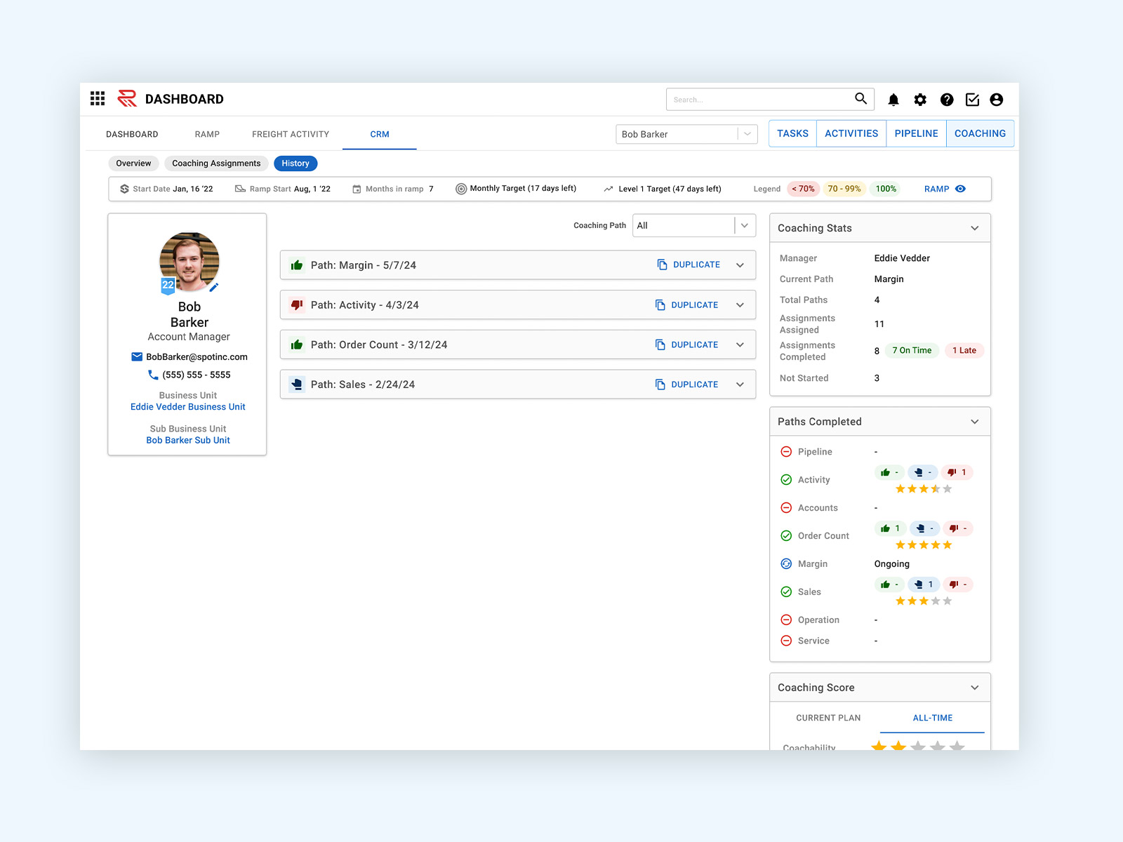
History
A way for sales people and managers to look back on past coaching sessions and see what has been worked on and what achievements have been made.

The Outcome
At the time of publication, Coaching had been implemented for about 6 weeks.
- - Favorable feedback from sales managers and account managers
- - A 4% increase in sales
- - Eliminated the use of Word Docs by sales managers to create coaching tasks
- - Uptick in account manager employee retention
- - Increase in customer onboarding