Energy Avenue - Design System / Information Architecture

Discipline:

Collaborators:
A New Design System
I was hired at Energy Avenue for web/graphic design work, but found myself doing UX work even though I wasn't very familiar with it at the time. Though the parent company had been around 30+ their EnergyAvenue.com website was about a year old. What stood out to me most about the site was how dated it looked (not even mobile friendly), and once I started digging I noticed inconsistencies littered throughout.
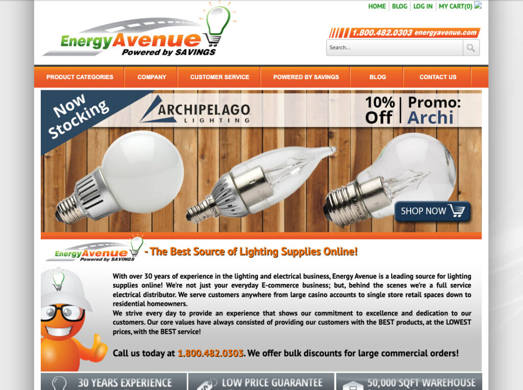
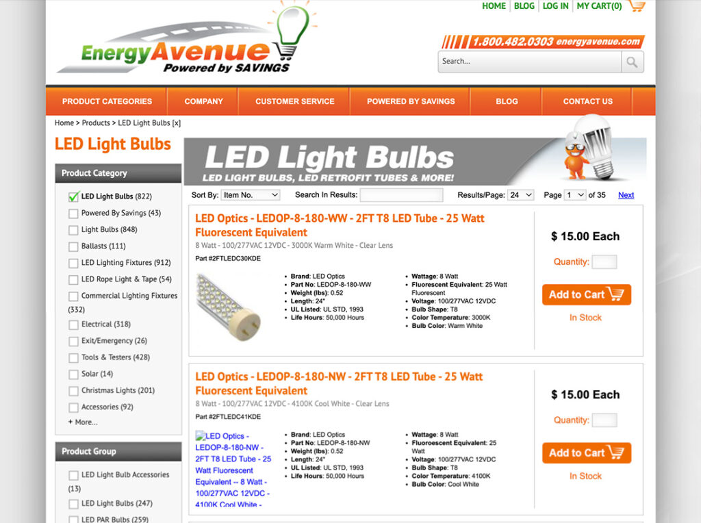
This site lacked a lot of basic design fundamentals. Several different oranges were being used in the color pallet. Shockingly buttons were .png images and not created with HTML/CSS. Font sizes and weights were all over the place.
Creating the System
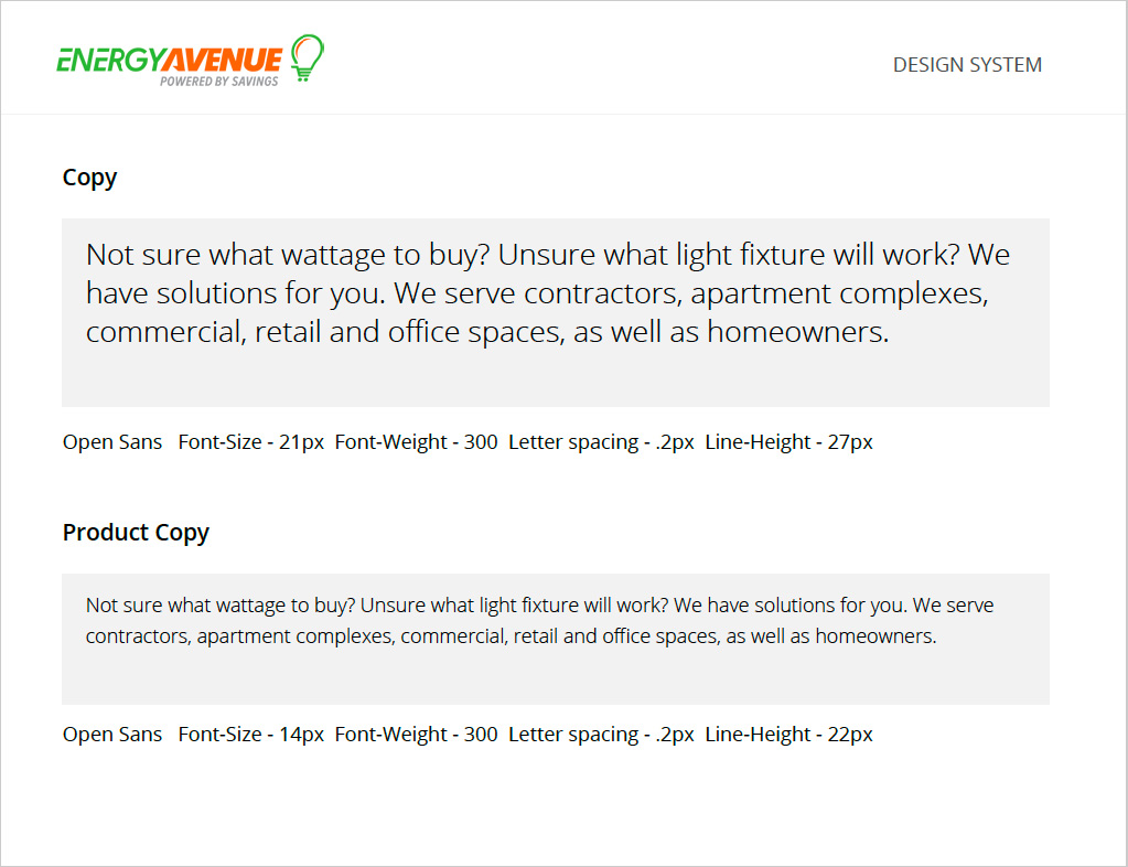
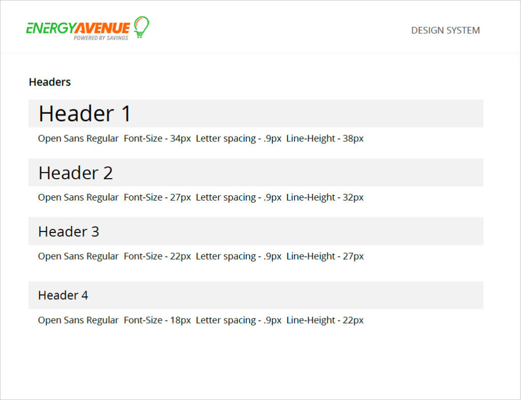
At this point in my career, I had never created a design system before. I had used established ones, but had zero experience creating one. Everything I learned from other designers about creating design systems was to start with typography.
Creating the System - Colors
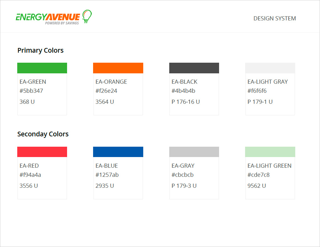
The current EA website had a primary color of orange, but used several different shades. The current color pallet also used a lot of gradients. Simplifying color choices would hhelp with consistency and hierarchy.
Creating the System - Buttons
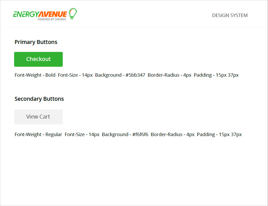
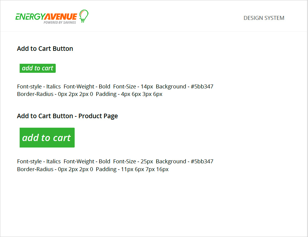
With typography being established, buttons could be created based off type choices combined with color choices. The current website was very orange. I wanted primary action buttons to stand out, and used the psychology of green being associated with "go" and "money."
Creating the System - Icons
Icons were split into 2 separate groups. Normal use icons that are found throughout most sites were an icon library. Product icons were used to show certifications like Energy Start rated. I used logos if the certification had one, or created these from scratch if they didn't.
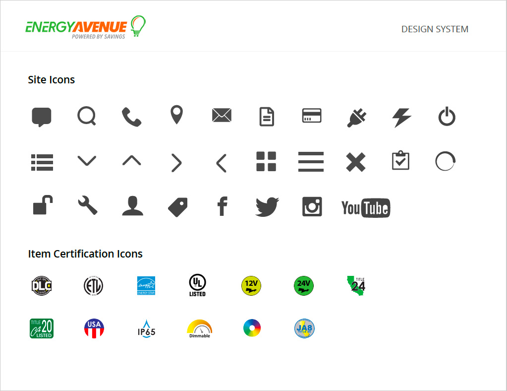
View the EA design system by Clicking Here
Information Architecture
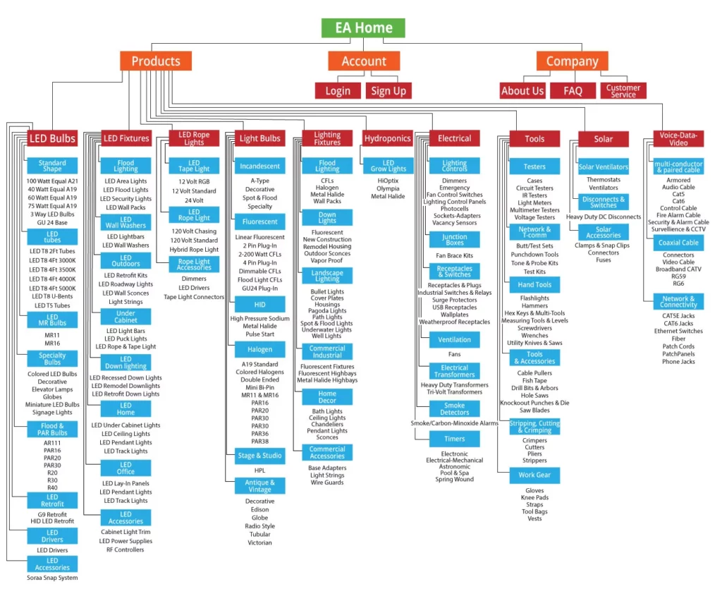
With a new system that would result in a new site, it was time to also update the information architecture. Before diving in too deep there were obvious places where updating was needed. We had categories that didn't even have products in them.
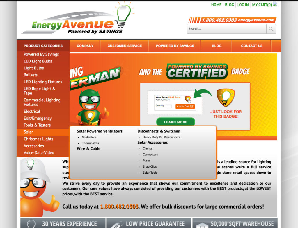
Knowing that the IA could be better, but being new to the supply industry, I decided the best place to start was by researching competitor's sites. Questions I asked were:
- How were they categorizing different products, like light bulbs vs. tools?
- Did it make sense to have products in more than one place?
- How did the filtering change for different products/categories?
Next, I conducted user testing over our current site. Gave users tasks to complete, in this case items to find to see how they tried to locate items, and if they could find them. What products were easy to find? Did they use the search bar? What did they search for? Did they use filtering?
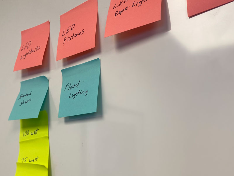
Based on my research and testing, I came up with changes that enhance the experience. For example Light bulbs that before were just in the LED category had been broken into LED bulbs, LED Fixtures, and LED Rope Lights.
The Outcome
After implementation, over the next 6 months we saw:
- Resolved frustrating usability problems
- A 4% increase in sales
- New mobile friendly site, increasing SEO
- New design system and site structure
- Implemented web best practices (no more .png images as buttons)