Driver App

Discipline:

Collaborators:
Taking a pre-existing app (with a 1.5 star rating) built for truck drivers to update and track shipments, and make it more intuitive while increasing usability and ease of use.Lay it on more thick about how bad this application is
User Stories
As a truck driver, I need to be able to update the shipment I'm carrying as quickly and easily as possible. Updates I need to be able to make include updating arrival/departure times and being able to easily upload documents.
Original App Layout
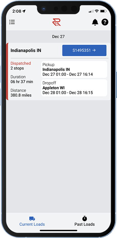
Every gray color, now available on one app.
My Role
I was the sole designer on this project, not only working to make the site more intuitive, but to implement our design system that was being used on our three other products, but hadn't been used on this product. I collaborated with the product owner, application support, and the development team.
Competitive Analysis
Info on trucking apps is hard to come by. In most cases you have to have a commercial drivers license in order to use the app. One of the easiest ways to gather info is to read app store reviews (Names of companies and reviewers were changed).
The Good

I've been using the app for about a year. IMO this app is one of the best when it comes to being easy to book loads, bid on loads and get paid. Detention is accrued through the app as long as you're on time. I like the app because it gives all the pertinent info on the load very

very good load board app. easy to use. the only issue I have is that not all loads show the rate of the loads, and I have encountered that the load board don't remove quickly the loads that have been taken from other drivers.

I like the fact that you can inform them of your status during the transportation. What break you're taking and how long. I've never had an issue with uploading the POD. The only glitch is not being able to upload multiple pages at once. Overall good app.
The Not So Good

App keeps popping up notifications that will not go away, and says I have a load in progress, even though I did not book a load

Search criteria does not work, cannot input criteria manually but have to use a touchy slider feature that never gets the exact number you want, no way to block a broker and there's no option to post my equipment are just a few of the reasons I deleted this app from my phone less than 5 minutes after downloading it.

You can forget getting Detention with these people. The way they have it set up with all the hoops you have to jump through youll NEVER get to see it. Email separate emails with BOLs, Invoices, "Signed"| Rate Confirmations plus your normal Transflo Invoice and BOL. Then you have to wait months and they still deduct the Quick pay fee........ And also who is going to take a 45lbs load 2500 miles for $.90 a mile when its costing $1.20 a mile in fuel ? ABSOLUTELY
Key Takeaways
The Approach
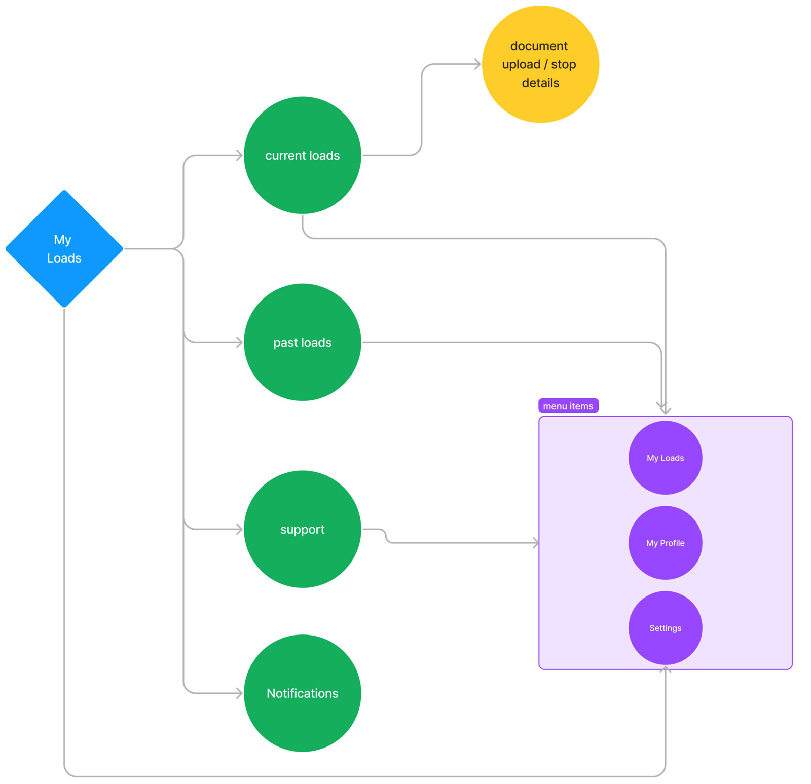
My approach started with me trying to use the app and seeing some obvious places for improvement. Next, I read every app review on the Google Play Store and the Apple App store. Then, I met with the support team. What did they hear most from users? Where were their pain points? What worked well, and what didn't?
The Solution
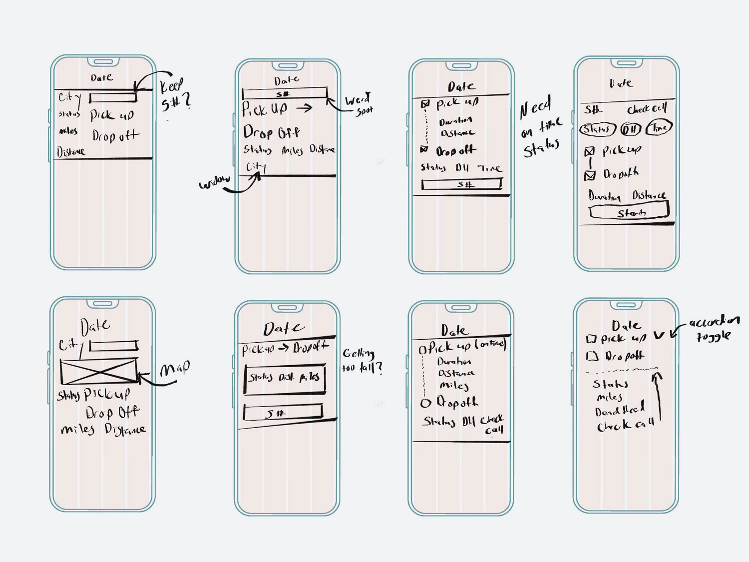
Make the obvious changes like come up with a unified header so notifications are available on all pages. User testing would find the "not so obvious" pain points. The current app was not inline with our design system. Now seemed like a good time to bring the app inline with our system bringing more unity to with it and our 3 other applications
The Homescreen
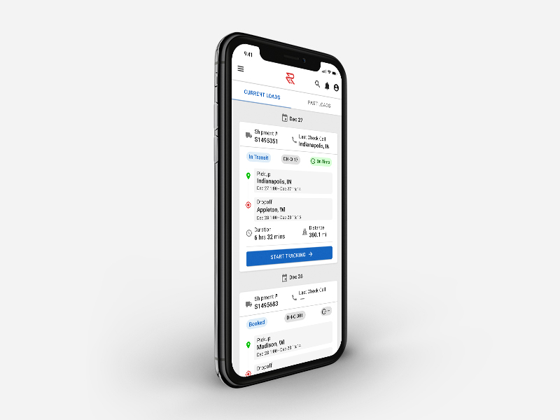
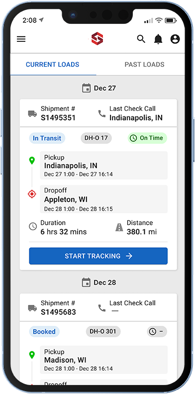
There were a lot of things that could be improved with the homescreen layout. The border on the left side of the shipment felt more like a design choice than it did a warning for being late. At first glance the city (Indianapolis) looks like it could be where the shipment began, but it's actually the last place a check call was made.
Add a blurb about support getting calls about truckers thinking they had started tracking after hitting the S button

Updating Details Screen
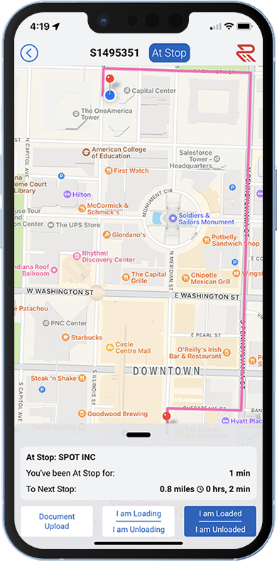
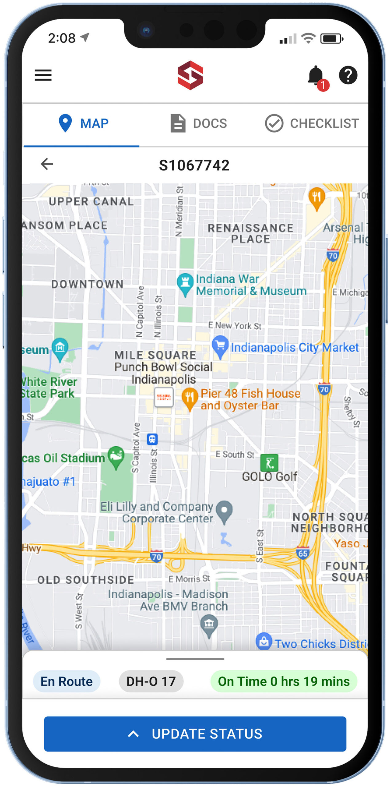
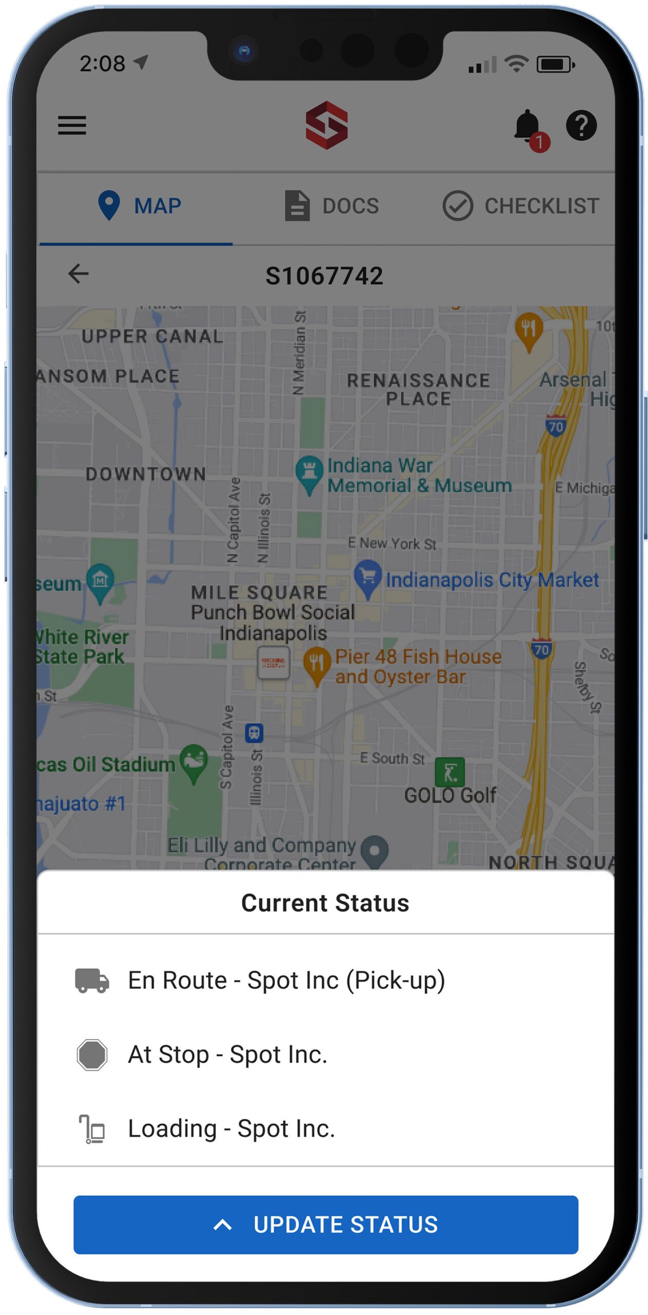
The details screen was primarily used as a way for drivers to update their status (i.e. "Unloading"). The obvious change here was to make the buttons less confusing. Here, we condensed the buttons down to one, and a drawer opened allowing users to update their status. The header was now consistent with the rest of the app, allowing users to receive notifications on any page. There's now a subheader consistenting up the driver's status, dead head miles and estimated time to arrival.

Updating Arrival Times
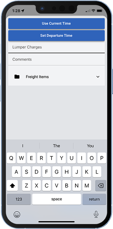
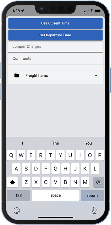
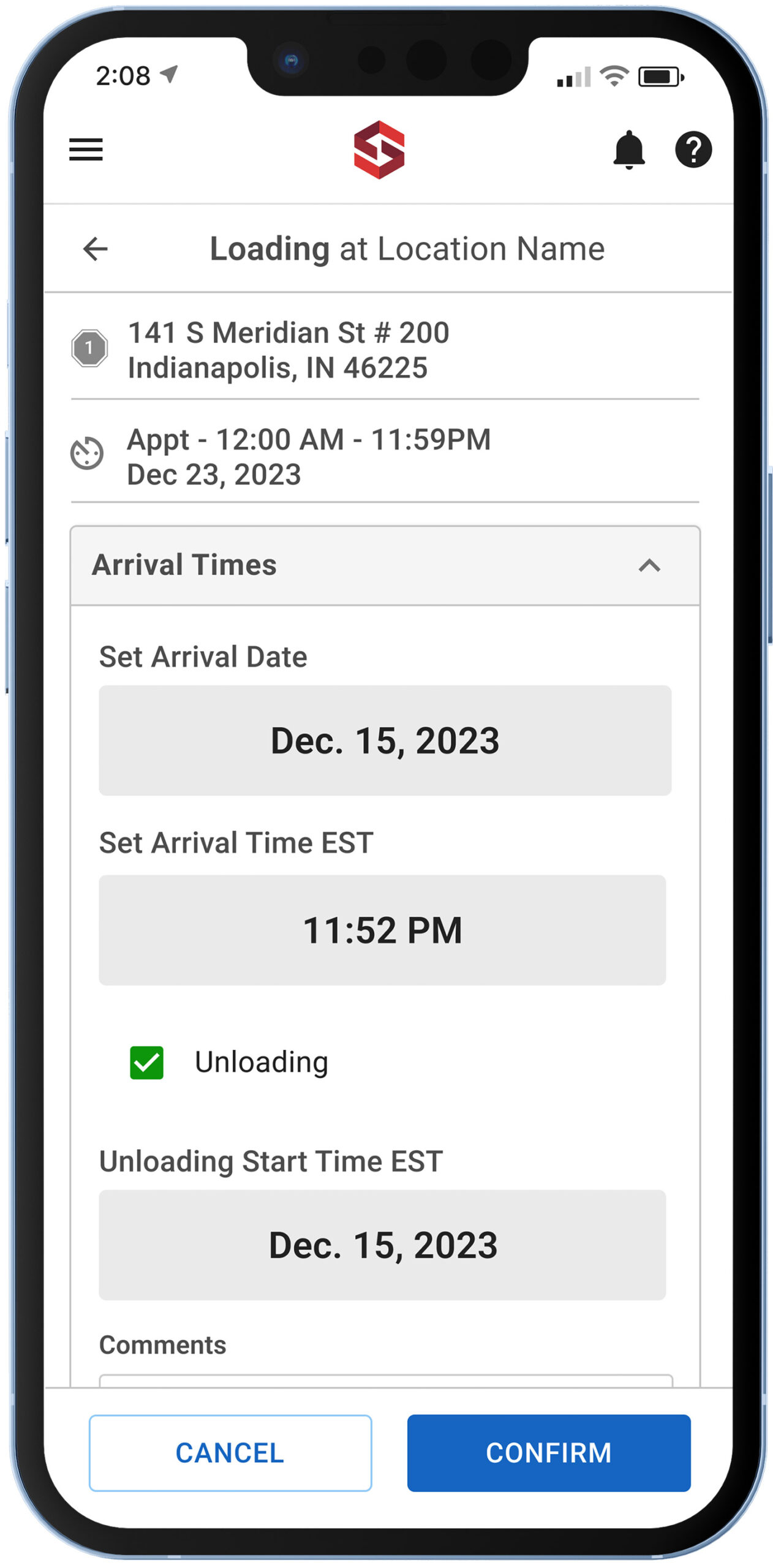
The original screen shows the importance of "Designing the Obvious." In this case "Lumper Charges" and "Comments: don't looks like fields users should type in. In the case of lumper charges, users were confused on whether they were suppose to confirm whether or not they had lumper charges or if they were supposed to type in a dollar amount. (mention the time auto defaults to the current time if the user wants to use it instead of having to check a box)
Uploading Documents
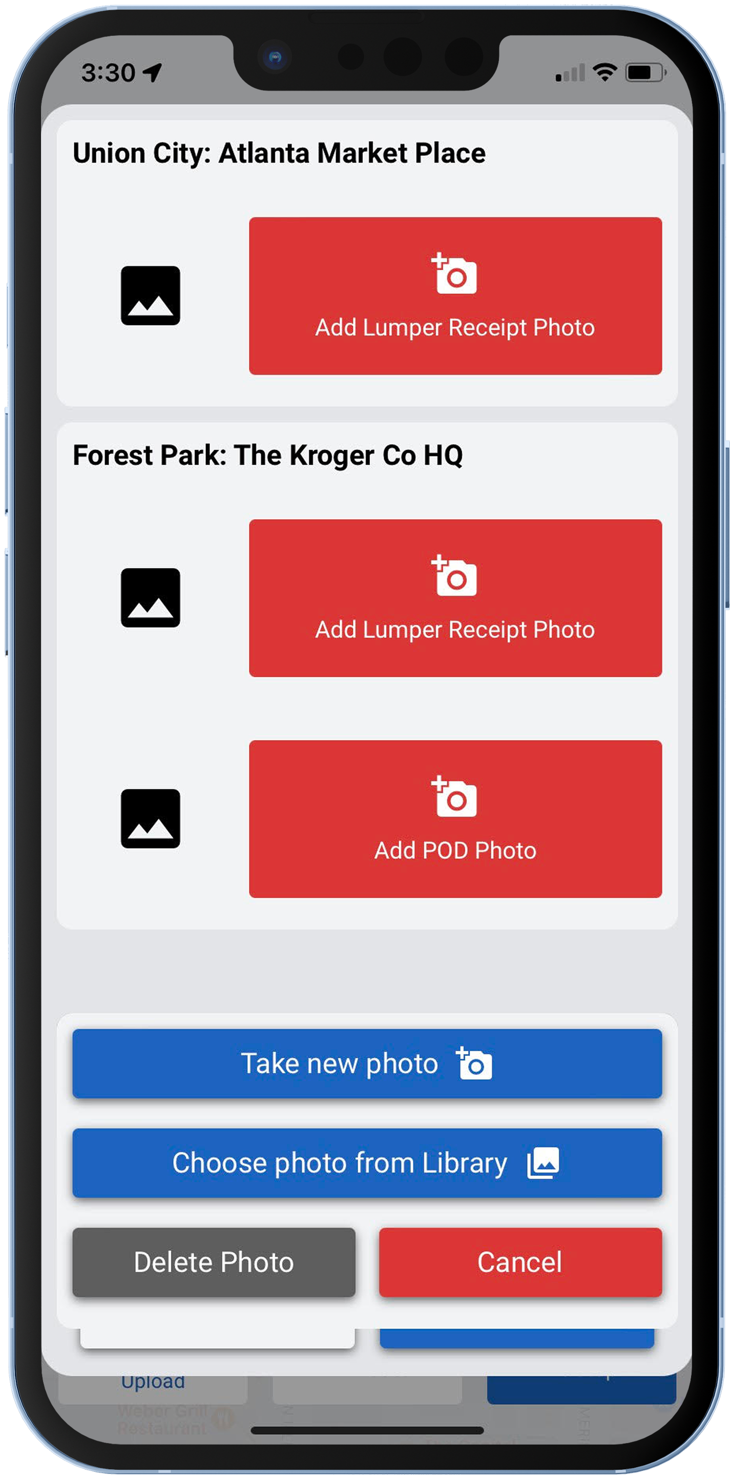
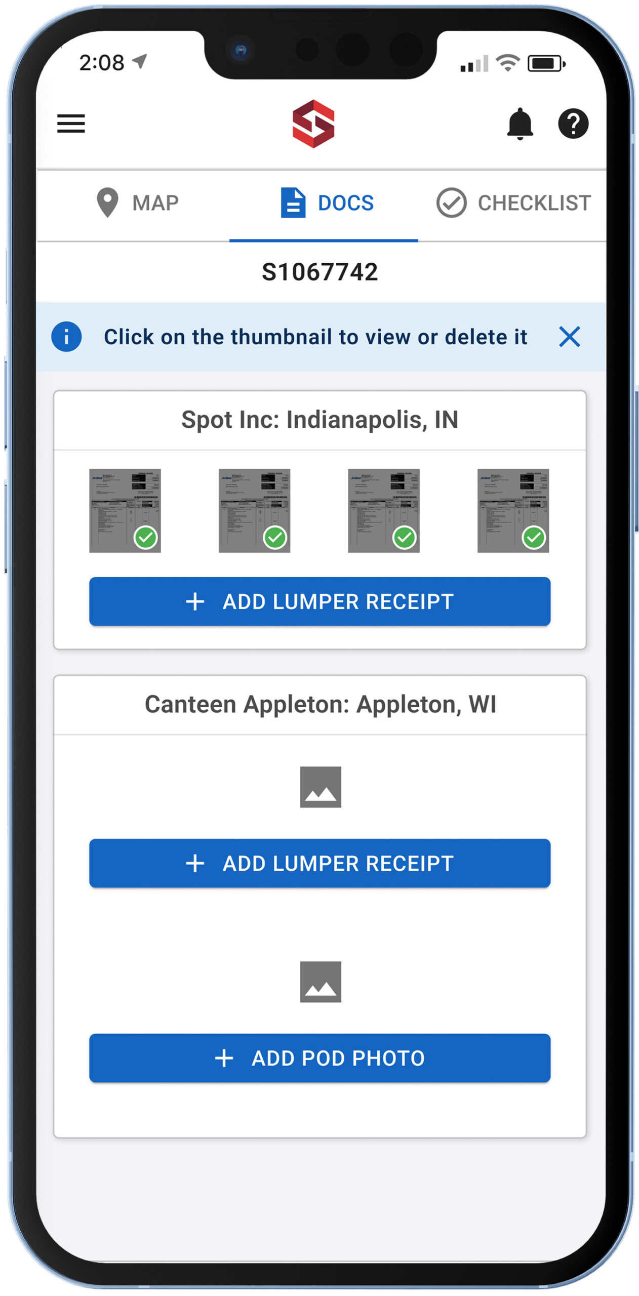
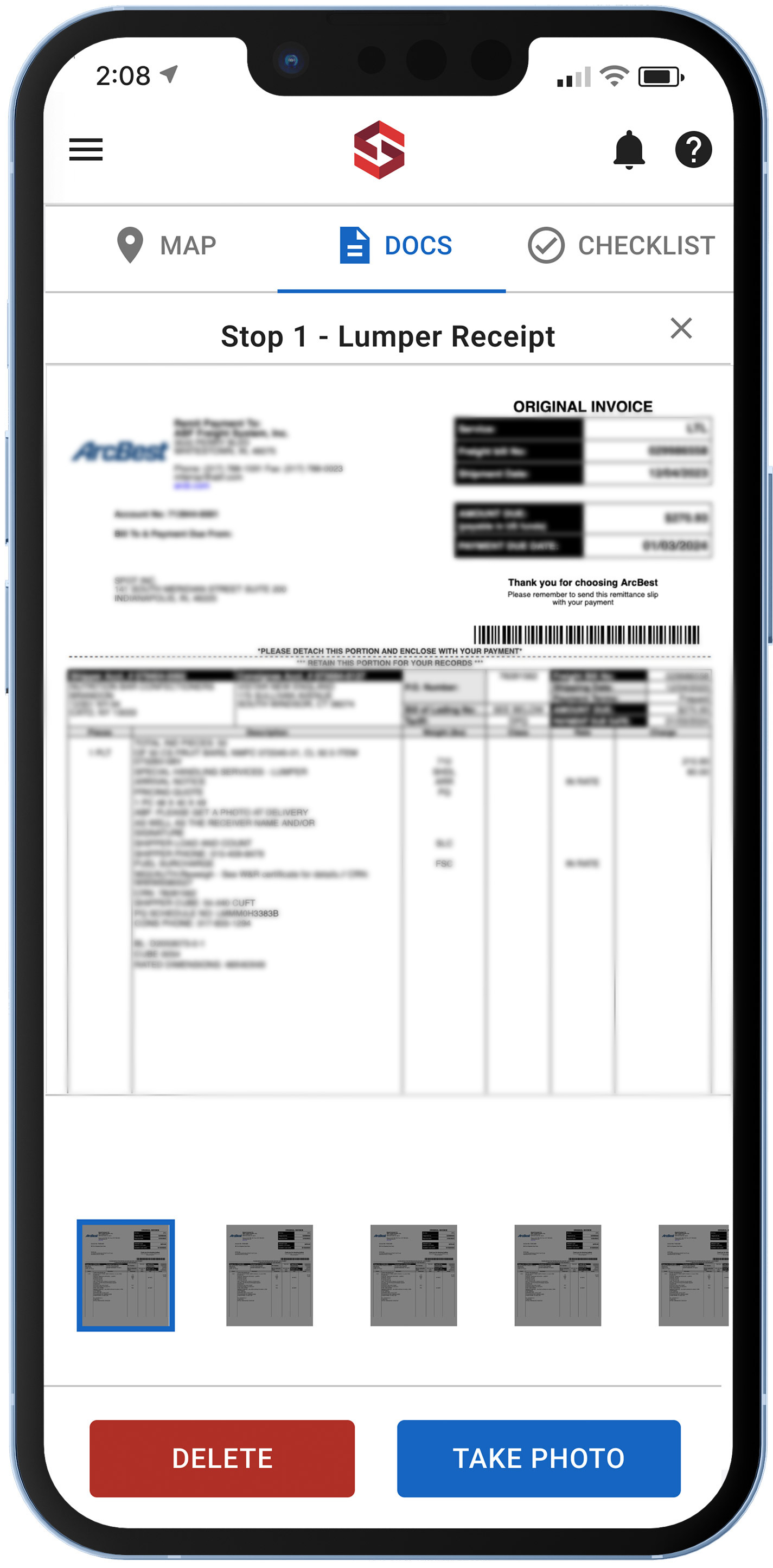
The original document upload screen had usability hurdles, in that users could only upload one image per document. The issues being, some documents were more than one page.
Add info about documents being tied to a stop and separating them
The Outcome
The original document upload screen had usability hurdles, in that users could only upload one image per document. The issues being, some documents were more than one page.